
An arch I designed for an existing set of stone pillars + wall. Has concealed LED in the top, and slips down over stubbed-out rectube. The area is somewhere smack downtown. The client decided, after this rendering, that this place needed a name. And maybe a sign? with the name? that says the name? Really? You think?
Tuesday, September 30, 2008
Sunday, June 15, 2008
GOODBYE YELLOW BRICK ROAD

Remember those shiny gold and turquoise pylon signs at Northcross? The Wizard of Oz signs? Well, they're history. I designed these two replacements, and kept things on the subtle side in consideration of the flap from the neighborhood, and the need for WalMart to just quietly slide into place. God, I feel dirty...
I used the architect's palette and elements from the entry, along with thin-stroke reverse channel letters mounted at their baselines, to keep this on the down low. I also had to work around the chrome-blingy Veranda signs below.
Wednesday, June 11, 2008
TESTING
(click for animation)
This is a wmv portfolio under construction. Probably about halfway done. I posted to view the progress...
EPIC FACE (theepicface.blogspot.com)


This is an 8 1/2" x 11" section from a drawing I've been working on over a period of years. The full size of the rendering is 4'-6" x 2'-0", so this is only a small section shown. Below is an inset of this one panel. Click on the full-size drawing to open a 400dpi 7MG file...as in, it takes a minute. There are scenes of battles, crucifictions, car shows, Roman architecture, a balloon show, jousting matches, hidden faces and bodies, and on. This is roughly 1/14th of the full drawing. When viewed from across the room, the image is of a hand covering a face with a single eye looking between the fingers. See the full shot at www.theepicface.blogspot.com
HOW SMALL IS SMALL?
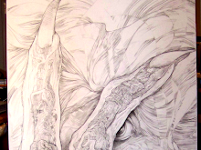
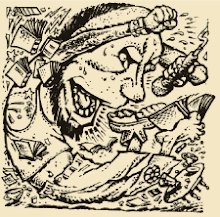
 While many of my creations are over 80 feet tall, my true forte' is drawing in near-microscopic dimensions. The pencil rendering above is only 5" in height, and the eye of the dragon measures 1/16". Floating around the dragon are hundreds of fairies, some of which are 1/64" tall. I don't need a magnifier to achieve these results. It's an eye-to-hand coordination thing, and I'm basically drawing blind.
Tuesday, June 10, 2008
THEY NEED IT FOR ALL THEIR FREAKIN' AWARDS...
 GoDaddy asked for a trophy cabinet for their plethora of awards. Say "plethora"? Plethora! We produced a chrome-finished structure with swinging glass doors, neon-plex shelves, interior LED lighting, and a push-thru backlit logo. This was a project made in Heaven: great client, great fun, and a final product that surpassed all our expectations. My shoulder hurts from patting myself on the back.
Monday, June 9, 2008
TRENDSETTING IN A CONSERVATIVE MODE...
I think the trendsetting for this new shopping center is the clean lines and lack of foo-foo add-on architectural crap. The design by Noack-Little arcitects looks like a feature in Architecture Today, rather than Strip-Mall Roundup. They supplied a drawing I suspect came from the client's 10th-grade high school art student. Very colloquial execution, and a fairly simple design, as are the building designs. And simple is good.
Friday, June 6, 2008

Friday, May 23, 2008
OLDER THAN ELVIS

...an illustration plucked from an Austin Chronicle from past years. The article was a book review of a fictional piece concerning Elvis' dead twin brother, Jesse, lost in childbirth. Ah, the Chronicle offices on I-35...also yellow, crinkly, and smelly.
Thursday, May 15, 2008
WACO GOES HIGH-END

WHAT JIM MORRISON NEEDED...

New art for a door specialist. He doesn't like working on glass doors but I don't really care. The art is a freebie, so there.
Friday, May 9, 2008
MIERCOLES CAN HAPPEN

Gold and columns out. Traditional ornamentation added. Cheap-out, and lose the red in the seal and you have a single color press-run. Die-cut, and no-cut..(click for enlargement)
Saturday, May 3, 2008
MONUMENT OR TEXAS-SIZED BBQ GRILL?
 A concept drawing and branding for a monument at a downtown hi-rise in Austin. The roof structure looks suspiciously like a grilling-surface. A natural Freudian design occurance for this bbq fanatic. Grill on, Wayne.
Wednesday, April 16, 2008

Tuesday, April 15, 2008


Thursday, April 10, 2008
CHANGE OF TITLE FONT...

Seal has been delegated to the rear of the band, and the main graphic is set in Bickham. Not as much punch as before, but the name of the roll is more predominant. Lean and clean.
Wednesday, April 9, 2008
THINK INSIDE THE BOX...
A kiosk design for Scott and White Healthcare in Temple. An absolute shot in the dark for a client that was expecting pencil roughs on a piece of paper. Featuring Greenglas 2111, routed aluminum graphics and led-illumination. Solitary confinement...
Friday, April 4, 2008
IT'S NOT ART, EXACTLY...
I'm posting this vid of my granddaughter on this site, because it was too large to email to some friends (you know who you are!) She's seen celebrating her first birthday by wearing her cake. MacKenzie Anglin was barely a week old when she was thrown from a moving car in a terrible wreck on 1431 outside Lago Vista. She was visited by angels in human form: members of the "Smoking for Jesus Ministry", who cared for her and prayed over her until EMS arrived. The Smokin' group was on their way to a gig in Austin from Kingsland, and stopped to render aid. Mac was found facedown in a dirt-rut, still strapped into part of the carseat, and apparently not breathing. Now look at her! She's huge and hungry and happy.
There were a number of strange and miraculous things happening that day, and I can only imagine the prayer circle around that week-old baby, asking the Lord for all his mercy. I, and my wife, didn't learn of the accident until 10 pm, and the wreck had happened around 3:00pm. We were in church at 5:oo and my wife suddenly began to cry for no reason, and told me she had a feeling of "great dread". We had no idea what had happened.
Mac' sister, Eleanor was left hanging upside-down in her carseat and was pronounced dead on the scene by the EMS. But, that wasn't God's plan... She was very much alive. The EMS and Fire Department and bystanders almost got into a throw-down over it. A week later on the local news, the controversy still went on. Nobody in our family blamed anyone for anything, though. We were counting the three out of four blessings we still had.
My only son, Aaron had been a youth minister and leader in three different non-denominational churches. He searched for the truth diligently, and asked very hard questions of his elders. Six days before his death, he was confirmed into the Catholic faith and joined the church I and his sister attend. He wasn't just going to join and smile, though. He had a lot of issues with Catholicism, and wasn't going to let anyone off the hook so easy! The Lord gave us brains for a reason.
To Tiffany Thomas, and all the SFJM people... I can't say "thank you" enough. MacKenzie is your legacy. We'd love to visit your church one day soon, and meet Bro. Wilbert, and everyone else. I also want to offer up our special prayers for Wilbert, and ask God to see him through any darkness he may be dealing with. As for everyone else...Hurricane Katrina may have taken and ruined countless lives, but for one little wiggly baby way over in Central Texas on September 23, 2007, that storm was a true blessing. We have not-so-little Mac!
Guess we can call her "BigMac", now.
All our love,
Ben and Patricia Anglin
Wednesday, March 26, 2008
DANGED OL' DANG...
This is my design for an interior ID sign at a flagship theatre project in Alabama. A mixed-use entertainment venue with fine dining, linens, cocktails, and such. The client went with us based on the look of these interior-mounted structures. The theatre opened in January, 2008. Black-tie in Alabama. Go figure.
Wednesday, March 19, 2008
A DINING EXPERIENCE YOU CAN'T REFUSE.
Badda-bing, badda-boom. Whatsa' matter for you? Just eat the pizza, ya sonofabitch.
STUCCO BOXES IN RAINBOW-LAND
Down and dirty monuments for a new development in somewhere or other. Posted this to evaluate the Teletubbies-sky treatment. Note the stiffened lifeless human form at right. That's known as a salesman. Even 3D technology can't dimensionalize a salesman...
Sunday, March 16, 2008
REBAR ARE BEAUTIFUL
 Why, yes, that IS what is sprouting from this makeover-design for an office complex in West Austin. 1.5" diameter iron bar. It's rustic, it's expressive, and it's easily replaced when it gets slammed by a Hummer.
Saturday, March 15, 2008
HAPPY BIRTHDAY, DAVE
Here's a birthday thang from Trish and me. We stared at that wooden one you currently have, for a week, and decided it should be demoted to the downstairs. I'm having our people route this next week. Rusty is, as rusty does, or I can have it finished in a specific color for ya'll. We can deliver it soon.
Anyhow, HAPPY BIRTHDAY OLD DUDE!!
IT'S SO BEEEEG!

Okay, I had absolutely nothing to do with this project, but I jumped into the shot just in time. A beeeeg guitar for Carlos Santana's new restaurant in Tempe. My codesigner-amigo, Jeremy Brooks suffered through a myraid of revisions and idiotic sales-think, to produce this mother. The 13' polycarbonate and aluminum guitar is internally illuminated with 15mm EGL designer white neon, and overlaid with a 2x digital print. It's an actual photo of Carlos' guitar.
Tuesday, March 11, 2008
WAFFLES AND GRAVY
...and cheese. Ponzio's Restaurant in Cherry Hill, NJ has been serving up comfort food for decades and their signage was looking it. Great old retro stuff that was losing its will to live. Ponzio's had been using a diamond-shape executed in a variety of raggedy corrugated-plastic displays and strange pole signs. Signs birds like.
For their new sign program, I adopted the funky patchwork/background art from their newly designed menus. I took their existing fork and plate graphic and popped it out 3D. The fork floats over multi-level routed plex graphics that form the plate. The channel letters are reverse-lit with push-thru 1/2" white plex faces. Some 15mm clear red neon, and it's time to eat.
Sunday, March 2, 2008
IT ALSO MAKES A SERIOUS MOCHA LATTE
Thursday, February 28, 2008

Wednesday, February 27, 2008
DON'TCH'ALL SCRATCH, NOW, BUBBA...
 I'll bet this completely messes with your game. It's hard enough to shoot on a dirty pooltable, much less a big ole' logo. I traded this "brand" (sorry, I had to use that) for the client's contribution to a charity, last fall. When they said it would be used on a tabletop, I expected a cut and paste job, but the product was a really clean digital print.
The first poor slob that spills a beer on this table is going to end up hanging from a tree.
LAST OF THE MIXED-FONT DESIGNS

Okay, it's hack-80's style, but hey, I had to get one more out before there's a law passed. I pulled it off, and the client was quite pleased, regardless. And I promise to never do it again.
Tuesday, February 26, 2008

after the smoke clears
Pardon my sloth, but this site is going to be thrown together like a drunk making a sandwich at 4 a.m. Please bear with the noise.
This is a fledgling effort at a web/blog-presence for me. Posting and editing and all that fun stuff...It's my chance to find out if I hate it, or if I REALLY REALLY hate it...I'll know fairly quickly.
My daughter is an award-winning blogger in the real estate world, and I've embarassed her a few times on her own site via comments. Now she has to worry about watching what I may be posting, here..
My beautiful wife, Trish, will also need to monitor the site, so I'm not wasting my time posting a bunch of gooey crap for no good reason...Make me proud, honey. ILYM
Friday, February 22, 2008
Disclaimer of complete irresponsibility...
Regarding the content of this site: Anything I say, insinuate, suggest, toss-around, muse-over, or whine about should be considered utter nonsense and I cannot be held liable for any hurty-feelings or crying over the silliness contained herein.
Monday, February 18, 2008
WATER SPORTS
Water features come at a hefty price, but the birds are happy and isn't that really what matters?
Sunday, February 10, 2008
A NEW USE FOR CHOPSTICKS
Happy Family Special! Facelit channels, routed/backlit cabinets, exposed 15mm clear gold, violet, and ruby red neons, and the world's largest chopsticks. See the product at the Triangle (Guadalupe @ Lamar in Austin).
Saturday, February 9, 2008
CHANNEL LETTERS WITH CURVES
(click for avi, or just look at the grey...)
Can't do much to make a medical job look sexy, except to place a 3D girl from IClone. Seems like all their models are built by 14 year old boys. None of them look like Ellen Degeneres or Barbara Bush...thank the stars.
"IT'S COOL INSIDE"...
a cool design from JankeDesign. I fleshed out their ai. files and made this baby hot...
Friday, February 8, 2008
FIFTY ON THE RED AND LET IT RIDE...
Smoke, if you have'em. Up in OKlahoma. New digs for an aging
casino. New sign, too...

casino. New sign, too...

Thursday, February 7, 2008
DONE DEAL
Houston Premium Outlets was completed this March. The main pylons were lit with digital LED for a sweeping color change from flickering flame to glowing blue-greens; I rendered their design in SketchUp to illustrate construction features. Ignore the bizarre colors on the animation. They're just there for fill...

Wednesday, February 6, 2008
MARQUEE MARK
(click for animation)
East Sixth Street, Austin. A new club slated for the 200 block. The historical district requires adherence to a "period" look. I guess it all depends on which period you mean... I remember the signs on sixth street back in the early 60's. Many were hand painted, and full of bullet holes, just like the store and tavern windows. Most of East Sixth street wasn't all that romantic, or historically exciting, just really rough. So rough, my mom would make us roll the windows up in the car, and she'd run the red lights.
I've designed an open-face channel letter v-sign with exposed neon, and sequenced incandescent chaser lights at the bottom of the cabinets; Marqueed cabinets with ZipaTrack lettering, white plex backlit panels, and tubular aluminum accents finished gold. Gold mirrored Chemetal laminated soffits around lamps; Open face "spade" with clear red 15mm neon;
There's an existing blade sign that may also be refitted. We'll see. Aces has the dubious honor of a tree-covered storefront. One of the few on sixth. Sign vs. Trees... Sign usually loses...
Wednesday, January 30, 2008
THE GENESIS OF GENESIS
 (Click for enlargement) Now at 2" x 4", the label art was readjusted to work on a standard cut-size available at Office-Deephole. These are a first-run for a first time product- showing this August 3, so there's no time to spare! (Hey,Richard/Liz: I have the label-stock, already, and will have these ready by Fri., if all's good with the designs. You can post a comment directly here, without having to email me). I wrapped a few of these on the Kerr Jars you supplied us with. Fits mighty nice... ignore the white "thingies" on top of the labels. It's just a patch that showed up on the png file I made for this post.
Sunday, January 27, 2008
AND ON THE JAR...

A 16 oz. Ball Jar w/ sealing lid. These are more expensive than plain clear jars, but folks know they're "keepers", for reusing, and drinking ice cold sweet-tay. Ball jars are hard to break, and have an old-timey "feel" when held. The embossing is part of that feel...
addendum to above: Looks like Richard's using Kerr Jars, because I have a jar of the spicy here with me, and spicy is not the word. The word is hot. and hot good.. good hot. goooood hot...
RICKY RICARDO WAS A CUBAN, TOO...


(click to enlarge images) A cigar label design for an importer in Texas. It was eventually dumbed-down to a plain-Jane product. Everyone's free to shoot themselves in their own feet.
Monday, January 14, 2008
SAND AND BUTTERCREAM ICING...

Return of the beach-cake. I'm all for realism, but I hope that's graham crackers or something edible. And those look like living Bromeliads or air-ferns. That's so cool! Now, if that was a Padre Island cake, there'd be a dead jellyfish and a syringe on top. Could be a niche market.
Subscribe to:
Posts (Atom)


